A foolproof way of figuring out which companies you shouldn't work for
.
Simply follow the steps below:
- Decide on a company that you are considering working for.
- Start a browser in incognito/private mode.
- Go to the said company's website.
- View their "Cookie Banner", and select the option that best describes the mess that's their "Cookie Banner":
- There is a simple "Accept" and/or "Deny/Accept only essential" option.
- The UI is designed to lead you to tap "Accept all" unless it's 9am, you have had your 8 hours of sleep, and have had 3 cups of coffee already.
- There is a list of 30 vendors which you have to go through, and manually accept/deny.
- You have to scroll for about 25 minutes to get to the Deny button.
- You get a multiple choice of performance, marketing, analytics, function, and possibly a few more.
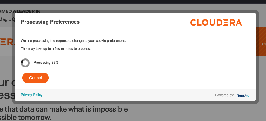
- Once you select "Deny", the banner starts showing you a "loading" component that shows their progress in switching off all the cookies.
- There is any mention of the word "legitimate interest" anywhere on the cookie banner.
- If you have selected option (1), go ahead and explore the company further to see if they may be a good fit for your next adventure.
- If you have selected any other option, under no circumstances should you be working for this company. Go back to step 1 and start again.
My favourite by far is (6), what a brilliant user experience.
And my "huh?" award goes to (5), like you want the users to go "yeah, OK, let me really take a moment and decide which cookies I want to allow: "Marketing cookies? yeah, go on then you can harvest my data, but functional cookies? No I don't think I want those, thank you."
I honestly don't get why you have to be so mean to your users.
Ali
p.s. a great example of number (6) from Cloudera:

A somewhat sensible example of number (1):
